Typography is a fundamental element of graphic design. It’s more than just choosing fonts; it’s about how text is arranged, styled, and presented to communicate a message effectively. The right typography can make a design look professional, enhance readability, and convey the desired tone and emotion. In this blog, we’ll explore the importance of typography in modern graphic design and provide tips on how to use it effectively.
Understanding Typography Basics
Typography refers to the art and technique of arranging type to make written language legible, readable, and visually appealing. It involves selecting typefaces, point sizes, line lengths, line-spacing (leading), and letter-spacing (tracking). A good understanding of these elements is essential for any graphic designer.
The Importance of Font Choice
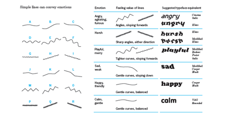
Choosing the right font is crucial because it sets the tone for your design. Different fonts convey different emotions and messages. For example, serif fonts like Times New Roman are often seen as traditional and reliable, while sans-serif fonts like Arial are perceived as modern and clean. Script fonts can be elegant or playful, depending on their style.
Creating Hierarchy with Typography
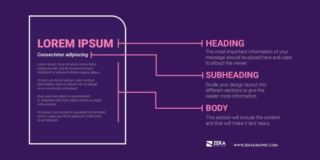
Typography can be used to create a visual hierarchy, guiding readers through the content in order of importance. This can be achieved by varying font sizes, weights, and styles. Headlines should stand out, subheadings should be distinct but less prominent, and body text should be clear and easy to read.
Enhancing Readability
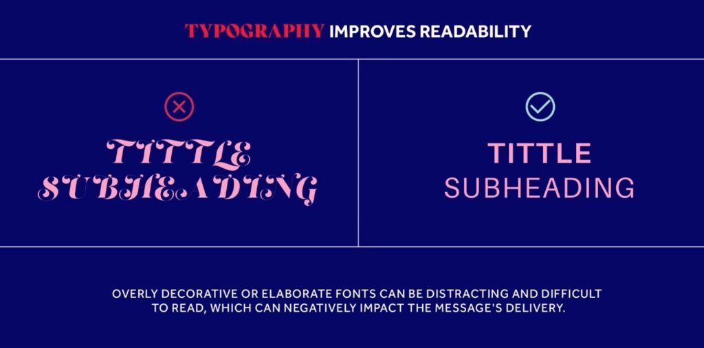
Readability is crucial in typography. It ensures that the text is easy to read and understand. Factors that influence readability include font size, line spacing, and contrast between text and background. Ensure that your text is large enough to read comfortably and that there is sufficient spacing between lines to avoid a cluttered look.
Pairing Fonts
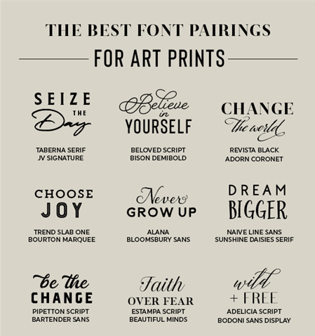
Effective font pairing involves choosing fonts that complement each other and create a harmonious look. A common approach is to pair a serif font with a sans-serif font to create contrast. Tools like Google Fonts and FontPair can help you find compatible font pairs.
Using Typography to Convey Brand Identity
Typography plays a significant role in conveying a brand’s identity. The fonts you choose should reflect the brand’s personality and values. For example, a tech company might use sleek, modern fonts, while a children’s toy brand might opt for playful, rounded fonts.
Custom Typography
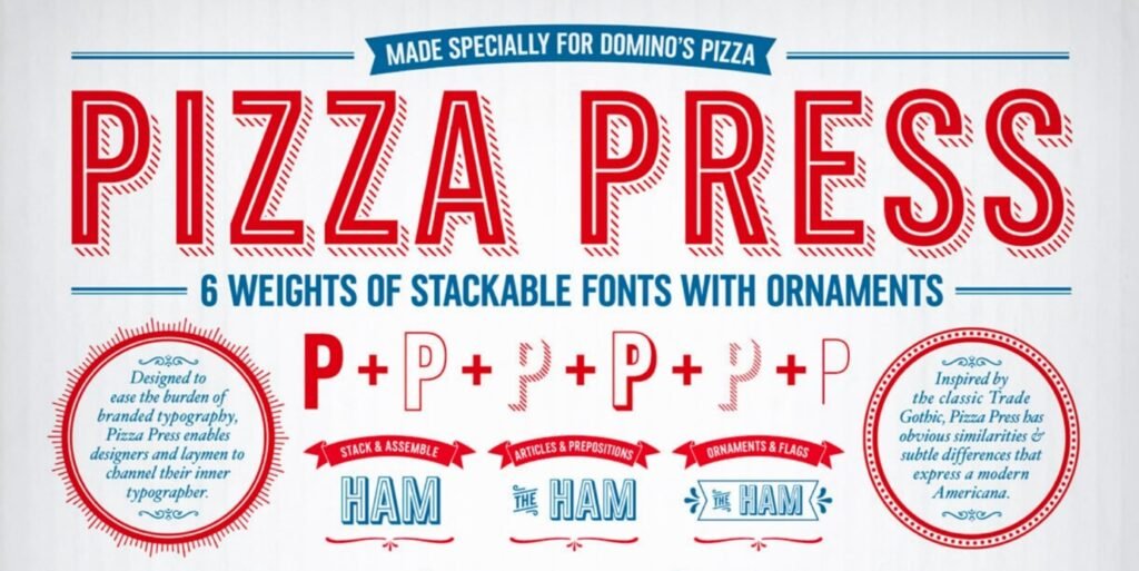
Custom typography can set a brand apart and create a unique visual identity. Creating custom typefaces or modifying existing ones can give your designs a distinctive look. This is often seen in logos and branding where unique typography can make a lasting impression.
Accessibility Considerations
Accessibility is an essential consideration in typography. Ensure that your text is readable for people with visual impairments. Use high contrast between text and background, avoid overly decorative fonts for body text, and ensure that your text is resizable on web platforms.
Conclusion
Typography is a powerful tool in graphic design that goes beyond aesthetics. It influences readability, conveys emotions, and helps establish brand identity. By understanding the basics of typography, choosing the right fonts, creating hierarchy, enhancing readability, pairing fonts effectively, using custom typography, and considering accessibility, you can master the art of typography and create impactful designs.

