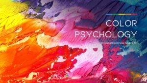
Color is a powerful tool in graphic design, capable of evoking emotions, influencing perceptions, and guiding decisions. Understanding color psychology can help designers create more impactful and effective designs. In this blog, we’ll explore how to use color psychology in your graphic design projects to communicate messages more effectively and connect with your audience on a deeper level.
The Basics of Color Psychology
Color psychology is the study of how colors affect human behavior and emotions. Different colors can evoke different feelings and responses. For example:
- Red: Often associated with passion, excitement, and urgency. It can increase heart rate and create a sense of urgency, making it effective for call-to-action buttons.
- Blue: Known for its calming and trustworthy qualities. It is often used in corporate designs to convey professionalism and reliability.
- Green: Represents nature, growth, and tranquility. It is commonly used in designs related to health, wellness, and environmental topics.
- Yellow: Evokes feelings of happiness, energy, and warmth. It can grab attention and create a sense of optimism.
- Black: Symbolizes luxury, sophistication, and power. It is often used in high-end product designs.
Choosing the Right Color Palette
Selecting the right color palette is crucial for setting the tone of your design and conveying the desired message. Here are some tips for choosing an effective color palette:
- Understand Your Audience: Consider the demographics and preferences of your target audience. Different cultures and age groups may respond differently to colors.
- Align with Brand Identity: Ensure that your color choices align with the brand’s identity and values. Consistency in color usage can strengthen brand recognition.
- Use Color Harmonies: Utilize color harmonies (such as complementary, analogous, or triadic color schemes) to create visually appealing and balanced designs.
Creating Emotional Impact
Colors can evoke specific emotions and set the mood for your design. Here are some examples of how to use color to create emotional impact:
- Excitement and Energy: Use vibrant and bold colors like red, orange, and yellow to create a sense of excitement and energy. These colors are great for promoting sales, events, and activities.
- Calm and Serenity: Soft and cool colors like blue and green can create a calming and serene atmosphere. These colors are ideal for designs related to health, wellness, and relaxation.
- Elegance and Sophistication: Use black, gold, and deep shades of blue or purple to convey luxury and sophistication. These colors work well for high-end products and services.
Enhancing Readability and Accessibility
When using color in design, it’s essential to consider readability and accessibility. Here are some tips to ensure your designs are accessible to everyone:
- Contrast: Ensure there is sufficient contrast between text and background colors to enhance readability. Use online tools to check color contrast ratios.
- Color Blindness: Consider the needs of color-blind users by avoiding color combinations that are difficult to distinguish. Use patterns and textures to differentiate elements when necessary.
- Consistent Use of Color: Use colors consistently to create a clear visual hierarchy and guide the viewer’s eye through the design.
Testing and Iterating
Finally, it’s important to test your color choices and gather feedback. Conduct A/B tests with different color schemes to see which one resonates best with your audience. Collect feedback from users to understand their perceptions and preferences. Iterate on your designs based on this feedback to ensure that your color choices effectively communicate your message and achieve the desired emotional impact.
Conclusion
Understanding and applying color psychology in graphic design can significantly enhance the effectiveness of your designs. By choosing the right colors, creating emotional impact, ensuring accessibility, and testing your choices, you can create designs that resonate with your audience and communicate your message more powerfully. Start experimenting with color psychology in your next project and see the difference it can make!


One Response
The design is simple and elegant. The customer support on this product is also amazing. I would highly recommend you to purchase templates from the Marketify team! Thank you for the wonderful project.